FANTASY MAPS
I DRAW YOUR WORLD
I have always been fascinated by the world maps on the cover pages of fantasy literature. Just like other kids, I greatly enjoyed mimicking those images and creating fantasy maps of my own. This became the gateway to a passion for worldbuilding in all its forms – be it texts, games, storytelling or drawing – that persists to this day.
Today I am the one supplying storytellers with custom maps of their fictitious worlds, continents, regions and cities. I have sold maps to both authors, game masters, and fans of RPG games
This genre includes being able to draw entertaining maps. And they don’t always have to depict cities or countries, either. A map can visualize anything from a galaxy, a world, a region or city to a mansion – or why not even a person’s body and mind? The common denominator is simply that they must been fun and inspiring to explore.
Äventyr is a commissioned piece for a Client - Made in Photoshop
To create convincing maps for fiction, you have to know a lot about how real mapmaking and geology work. As part of this research, I joined an online cartographers’ guild and studied geology. I learned how oceans, mountains and pressure zones affect climate and biomes, that water does not take the shortest
path to the ocean, but rather the easiest one, and that rivers never split, but instead merge, on their way to the ocean.
CAPTURING YOUR ATMOSPHERE
An important aspect to take into consideration when designing and drawing maps for fiction is the mood and tone of the fiction itself. A map is not just a functional representation of geography — for our users its mostly a visual storytelling tool that helps immerse the audience in the world. Different settings have different moods, and art accompanying a setting should reflect that.
If the setting is colorfully happy or horrifyingly dark, the art must follow suit. Here I will delve deeper into the game Blades in the dark, a dark setting set in a haunted industrialized city, inspired by Prague and Venice mixed together. (Lovely cities btw)
THE DESIGN CHALLANGE - AS STORYBOARD
I believe that the particular product Blades in the Dark could have been executed with more intentionality. A page from the rulebook for the role-playing game Blades in the Dark sets an inked aesthetic tone as its art direction. However, the tone of other art assets, images, and maps within the rulebook is not consistently cohesive.
In response, I felt compelled to create a map rendered in an inked style—especially fitting given that the water is sometimes described as black, resembling ink in the fiction. I have below drawn a map that I believe better captures the established tone and atmosphere.
“The city Doskvol is a melting pot of tension. Its oppressive, dark and a haphazard. Water channels are as plenty as its twisted roads. Here we find our dear scoundrels chases by the bluecoats”
THE FINISHED RESULTS

“The crowded city is protected by a massive wall of light, light is the only protection humans have from spirits and demon plaguing all land since the gates of hell shattered 1000 years ago”
CROWDED SLUMS AND CLASS DEVIDE
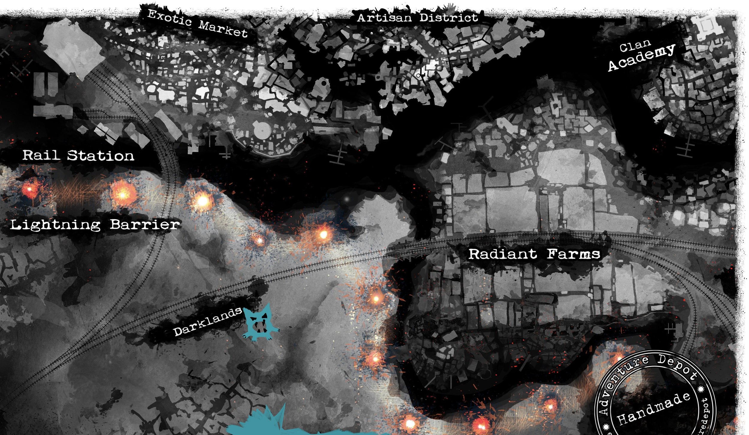
A crowded district flanked by slums and channelsA previously upper class district, now fallen en in disrepairThe massive lightning barrier, powered by demon blood. The industrial revolution has pushed the city to its limit, and the city can now only grow upwards. The shattered sun, eternal darkness, and haphazard constructions are fertile ground for all criminal activity.My finished map for the game - Blades in the Dark.
An unofficial product, of which individual copies have been sold to fans.
The game is set in an industrial post-apocalyptical world, where the gates of Hell have been destroyed and the sun shattered, plunging the world into an eternal night. A crude wall of lightning towers protects the city from the ghosts of dead souls that cannot pass into the afterlife. I designed the map from bits and pieces of information found within the game’s rulebook.
For example, I chose a dark grayscale to reflect the concept of an eternal night, letting the lightning towers be the only objects of color to accentuate their importance to the city. I also made the canals black in accordance with the fiction’s lore. Another important part of the fiction is the gulf between the city’s societal classes – that inequality is greater than ever in these harsh conditions. This I chose to represent by dividing the map into distinct, contrasting areas: The rich, light upper class districts and the sprawling, chaotic poor working-class ones.
The close placement of the palace and the added slum areas now reinforce the theme of class divisions. As a storyteller, I always make sure to include at least one scene for each central theme already in the first role-playing session, meaning that the map—and everything else—should reflect these core themes as well.
Here, I took inspiration from how roads are illustrated in the map for the game Dishonored. I also took the opportunity to tweak the layout of the districts compared to the official map. A major difference that nerds will notice is that I have added railway tracks, which now don’t just lead to Gaddoc Station but also to the harbor and refinery, since in the fiction, the city of Doskvol supplies the entire continent with refined electroplasm (made by demon blood to power lightning barriers across the whole empire). As a result, the Governor’s Palace is now placed next to this crucial resource.
My abstract drawing style sets the desired tone
A rectangle on the map can sometimes represent a block, sometimes a building. What is a canal and what isn’t? Some buildings and roads are in deep darkness—maybe they’re underwater, or perhaps the lighting reflects how wealthy and protected an area is?
I like when maps are abstract, but they should still be recognizable as maps; otherwise, I wouldn’t get to indulge in drawing them, which I think all of our inner children enjoy sketching from time to time.
To me, brightness sometimes corresponds to notable locations—places that have names in the fiction. Sometimes it represents elevation differences, sometimes class differences. These concepts go hand in hand, so why not merge them into a single value (grayscale) if further granularity doesn’t enhance the storytelling then dont bother. Composition was the main guiding principle in this work, but it starts to break apart when zooming out, so in that sense, it’s somewhat of a failure.

HEDBLOM DUNGEON MAPS
Blueprint of a small Crypt (Photoshop) - Candles and shelves ornate the areaMAP OF A CANDLE LIT CAVE
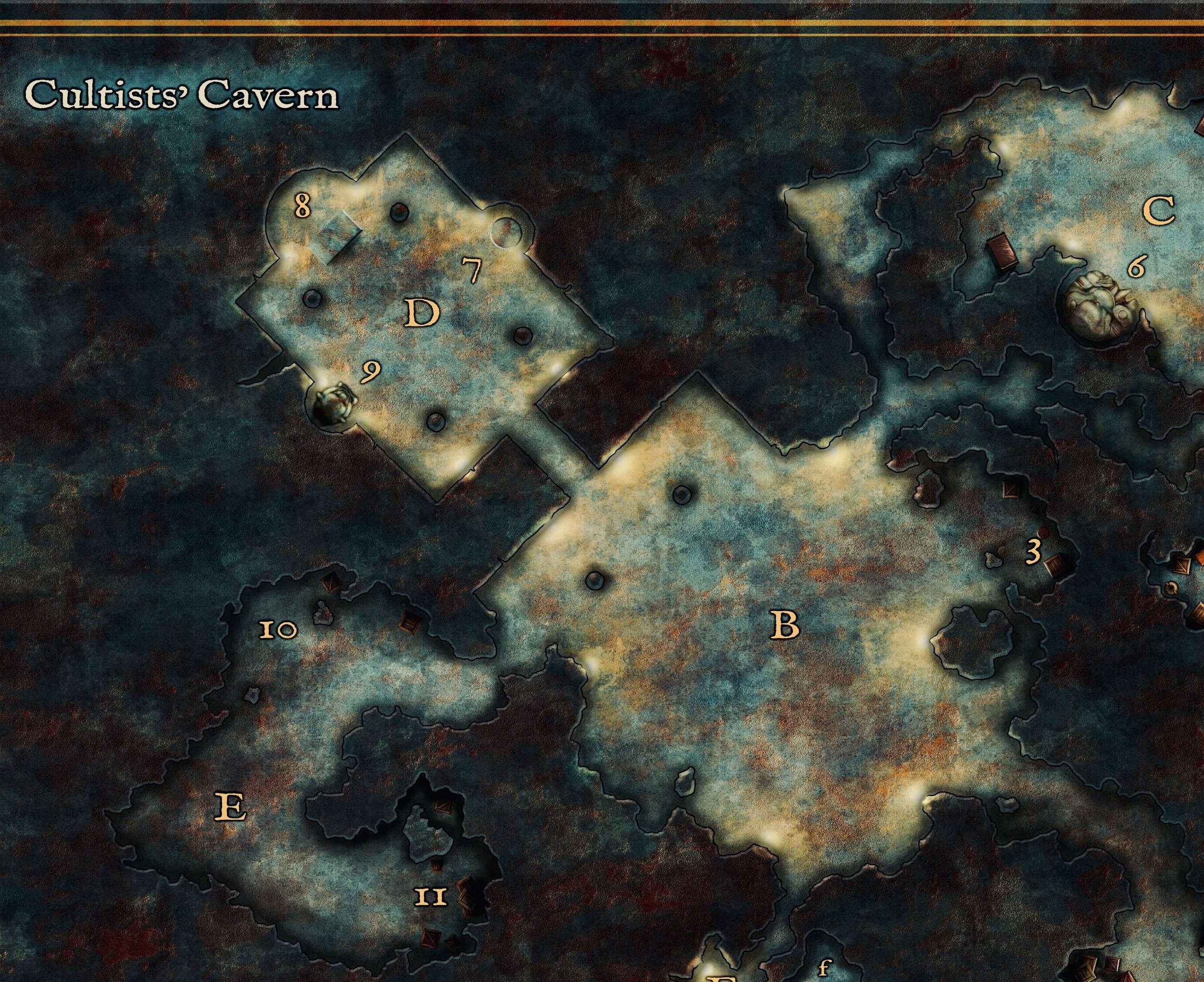
Dungeon map of a candle lit cave (Photoshop)

The area is filled with pillars and crates. For this project, I designed my own textures for the stone walls and flooring, usually textures can be used from data bases. The blend of teal and rustic orange is an unexpected yet striking choice, enhancing the fantasy atmosphere of the setting.
A young author’s wish come true
Commission piece made in Photoshop


